ADMIXTURE analysis
Admixture is a very useful and popular tool to analyse SNP data. It performs an unsupervised clustering of large numbers of samples, and allows each individual to be a mixture of clusters.
The excellent documentation of ADMIXTURE can be found at /projects1/tools/admixture_1.3.0/admixture-manual.pdf.
Converting to Plink format
ADMIXTURE requires input data in PLINK bed format, unlinke the EigenStrat format that we have already used for both Principal Component Analysis and Outgroup F3 Statistics. Fortunately, it is easy to convert from Eigenstrat to bed using Eigensoft’s tool convertf, which is installed on the cluster. To use it, you again have to prepare a parameter file with the following syntax:
genotypename: <Eigenstrat.geno>
snpname: <Eigenstrat.snp>
indivname: <Eigenstrat.ind>
outputformat: PACKEDPED
genotypeoutname: <out.bed>
snpoutname: <out.bim>
indivoutname: <out.fam>
Note that PACKEDPED is convertf‘s way to describe the BED format. Note that for admixture, the output file endings are crucial, please use *.bed, *.bim and *.fam. You can then start the conversion by running
sbatch --mem=2000 -o $LOG_FILE --wrap="convertf -p $PARAMETER_FILE"
This should finish in a few minutes.
Running ADMIXTURE
You can now run admixture. The basic syntax is dead-easy: admixture $INPUT.bed $K. Here $K is a number indicating the number of clusters you want to infer.
How do we know what number of clusters K to use? Well, first of all you should run several numbers of clusters, e.g. all numbers between K=3 and K=12 for a start. Then, admixture has a built-in method to evaluate a “cross-validation error” for each K. Computing this “cross-validation error” requires simply to give the flag --cv right after the call to admixture. However, since this tool already runs for relatively long, we will omit this feature here, but it is strongly recommended to use it for analysis.
One slightly awkward behaviour of admixture is that it writes its output simply into the directory where you start it from. Also, you cannot manually name the output files, but they will be called similarly as the input file, but instead of the ending .bed it produces two files with endings .$K.Q and .$K.P. Here, $K is again the number of clusters you have chosen.
OK, so here is a template for a submission script:
#!/usr/bin/env bash

BED_FILE=...
OUTDIR=...
mkdir -p $OUTDIR

for K in {3..12}; do
    CMD="cd $OUTDIR; admixture -j8 $BED_FILE $K" #Normally you should give --cv as first option to admixture
    echo $CMD
    # sbatch -c 8 --mem 12000 --wrap="$CMD"
done
Note that the command is sequence of commands: First cd into the output directory, then run admixture in order to get the output files where we want them.
If things run successfully, you should now have a .Q and a .P file in your output directory for every K that you ran.
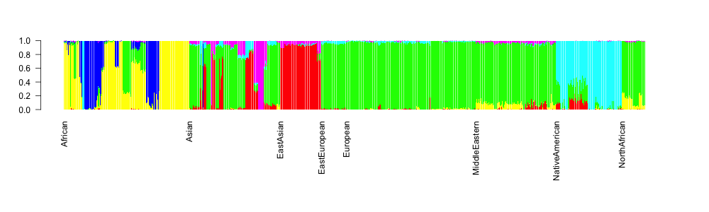
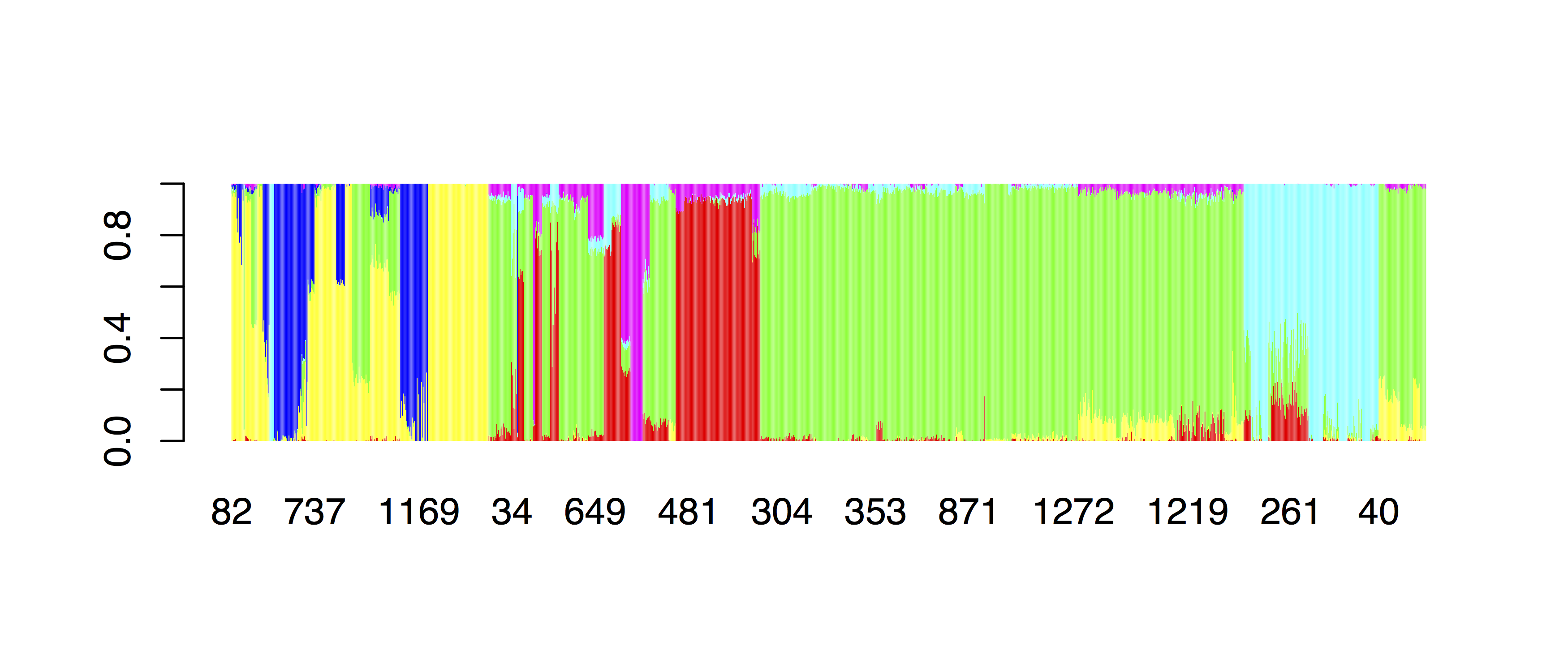
Plotting in R
Here is the code for making the typical ADMIXTURE-barplot for K=6:
tbl=read.table("~/Data/MyProject/admixture/MyProject.HO.merged.6.Q")
indTable = read.table("~/Data/MyProject/admixture/MyProject.HO.merged.ind",
               col.names = c("Sample", "Sex", "Pop"))
popGroups = read.table("~/Google Drive/GA_Workshop Jena/HO_popGroups.txt", col.names=c("Pop", "PopGroup"))

mergedAdmixtureTable = cbind(tbl, indTable)
mergedAdmWithPopGroups = merge(mergedAdmixtureTable, popGroups, by="Pop")
ordered = mergedAdmWithPopGroups[order(mergedAdmWithPopGroups$PopGroup),]
barplot(t(as.matrix(subset(ordered, select=V1:V6))), col=rainbow(6), border=NA)
which gives:
OK, so this is already something, at least the continental groups are ordered, but we would like to also display the population group names below the axis. For this, we’ll write a function in R:
barNaming <- function(vec) {
    retVec <- vec
    for(k in 2:length(vec)) {
        if(vec[k-1] == vec[k])
            retVec[k] <- ""
    }
    return(retVec)
}
and we can then replot:
par(mar=c(10,4,4,4))
barplot(t(as.matrix(ordered[,2:7])), col=rainbow(6), border=NA,
        names.arg=barNaming(ordered$PopGroup), las=2)
which should give: